Documentation
Below you can discover all the secrets behind the styles that we created.
If you are interested in testing them yourself, scroll down: you will find all the information that you need.
Below you can discover all the secrets behind the styles that we created.
If you are interested in testing them yourself, scroll down: you will find all the information that you need.
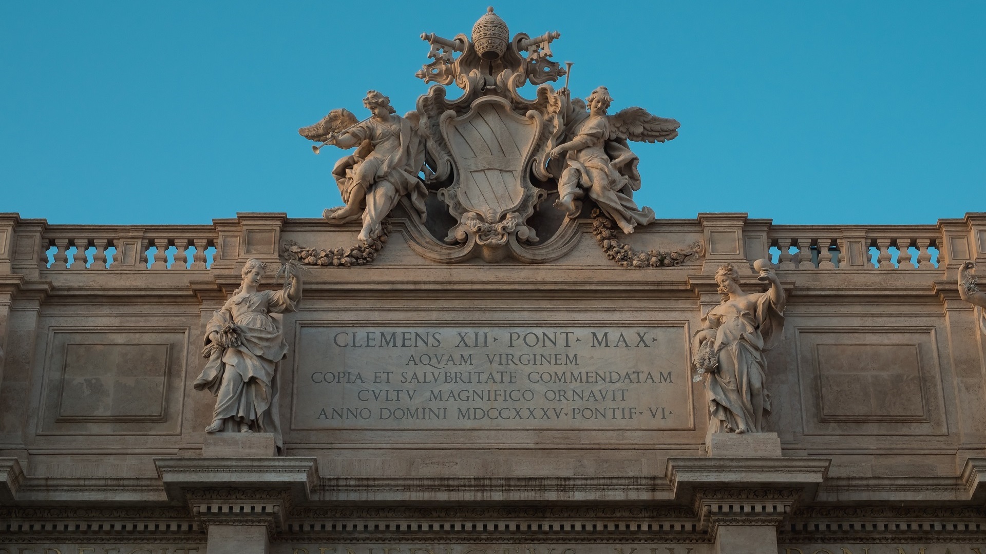
The inscriptions, which the Romans called tituli or inscriptiones, were a powerful means of mass communication, widespread and exposed throughout the territory of the Roman Empire. This style is inspired, in its general lines, by public inscriptions from the reign of Augustus, when monumental inscriptions developed into what we might term their “classical” form.
Marble was extremely available in Rome thanks to the expansion of the Carrara marble quarries and was the most commonly used material for public inscriptions. The image I used represents a white marble wall, which I used to recreate a slab, a typical support on which texts were engraved and then affixed to public monuments. On the plate, the inscription can appear in a free field or in a mirror delimited by a relief frame, as in the case of the example that I reproduced using the shadow box (Neumorphism.io).
The larger the plate and the more letters an inscription contained, the higher the cost. For this reason, even in the case of public inscriptions, the spaces were expertly used and reduced to a minimum, without however neglecting the clarity. Two key stages were involved in the production of inscriptions: first, the arranging of the text on the stone’s surface (the ordinatio) and, second, the actual carving of the text (sculptio). In the ordinatio the stonecutter would use an L-shaped carpenter’s square and measure stick to ensure that the inscribed field was as near to a true rectangle as possible. Then the surface was slightly scratched in order to create vertical lines that delimited the surface and horizontal lines, in pairs, which were used to delimit the letters.
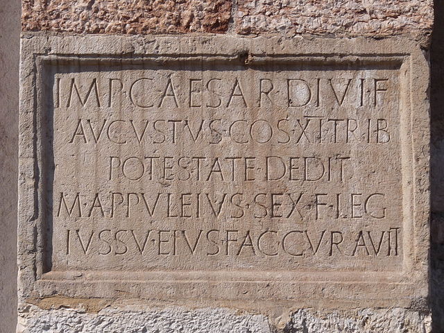
The basic technique of inscribing a text on stone involved the use of a wooden-headed mallet and an iron chisel, or usually a variety of chisels. To give the idea of an engraved text I used the text-shadow property.
During the reign of Agustus the lettering that is known as “monumental square capitals” (scriptura monumentalis or capitales quadratae) started to become widespread. The letters are characterized by harmony, tendency to geometrize the shape, right angles and regular proportion between height and width, elegant apexes and search for pleasant chiaroscuro effects. To reproduce the resemblance, I chose Cinzel typeface, inspired in first century roman inscriptions, and based on classical proportions. Cursive writing was typical of private writing such as letters and graffiti and was practiced mainly on other types of materials. However, there is no lack of examples of the use of some cursive characters within texts engraved in capital writing. In this case I used Cinzel Decorative.
After carving a text, the stonecutter might add certain features to aid its legibility or, at the very least, its visibility, especially in case the inscriptions were hanging on a wall. In general, in longer texts, paragraphing and layout helped readers or viewers make better sense of the overall architecture of the text.
Two more “colorful” ways to aid visibility were the rubricatura and the use of “mobile letters”. The first case was the application of cinnabar (minium) to pick out the letters in red, which as a result came to be known as litterae rubricatae. I used it for small headers, bold and link. The second was a technique that consisted of engraving a wide and deep groove for each letter on the surface, inside which mobile letters made of metal (bronze, gilded bronze, but also gold) were fixed. I reproduced this technique for the headings of the header, using the gold color and the text-shadow to make the text appear slightly raised.
Moreover, sometimes individual letters or groups of letters were surmounted by a horizontal line, which served to indicate to the reader the abbreviation character. I decided to use this feature for link decoration instead of the classic underline. Interpuncts helped indicate where one word ended and the next one began when the scriptio continua was used (a style of writing without spaces). Triangles were the most common form, and I used them for unordered list.
The figures represented inside inscriptions were very often made in relief. For this reason, I used box-shadow to create a similar effect.
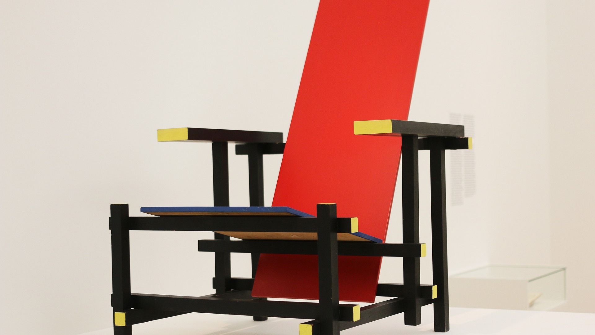
We decided to select for the time period of the first part of the XX century the typographical style of the Bauhaus, as this art school influnced in a consistent way its time: It's complete name was Staatliches Bauhaus, an art school and design movement active in Germany from 1919 to 1933, started by Walter Gropius. It was strongly related to the functctionalism and the rationalism
The artist movement of the Bauhaus was the heir of the pre-war avant-garde movement, related to the Industrial Revolution and the cultural field taht took place in Europe around the 1800. One of its main purpose was a new educative method that was able to connect art and handicraft and to integrate in the functionalism of the industry.
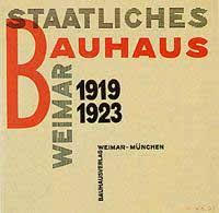
We decided to reproduce the Bauhaus Style basing on its basic and essential structures and forms. We paid particular attention to the idea related to the geometrical uses of the spaces, the geometrical forms and the attentive selection of the primary colors of this style. Architecture and design were the main disciplines of this school.
The basic background we choosen it's an image of paper ruined by water from which we changed the attribute color in sepia, in order to underline the idea of antique paper. We took this image from Unsplash.

The colors selected are taken from the Bauhaus Style idea of primary colors, we concentrated particularly on red, white and black. The exact code of the red we selecte is #FF0000, while for the links we selected another grade of red, which is #B22222, in order to distinguish the links already checked.
The space was regulated through the use of fixed flexboxes aligned in the extreme right(flex-end) or left(flex-end) of the page, and we decided to rotate the title and to add some geometrical shapes to the borders in order to mark the idea of the space's schematism. The interline was placed at 1.8 also to respect the organisation of the spaces.
For the font our choice was the Righteous font, a geometrical and grid based typographical style, inspired by the all capitals letterforms from the deco posters of Hungarian artist Robert Berény for Modiano (1930). This artist operated in the Bauhaus's period and was strongly influenced by this movement, so we recognized in this font some of thr characteristic of the typhographical style of the Bauhaus: the attention to the space, the serif and coursive decorativeness, the shapes inspired to the capital letters and the bold appearance.
The images are shown in black and white and are considered part of the designing structure of the page. They are placed with the technique of flexboxes at the flex-start of the page, on the opposite side of the p elements. The result is a nice formed and shaped space similar to a chessboard.
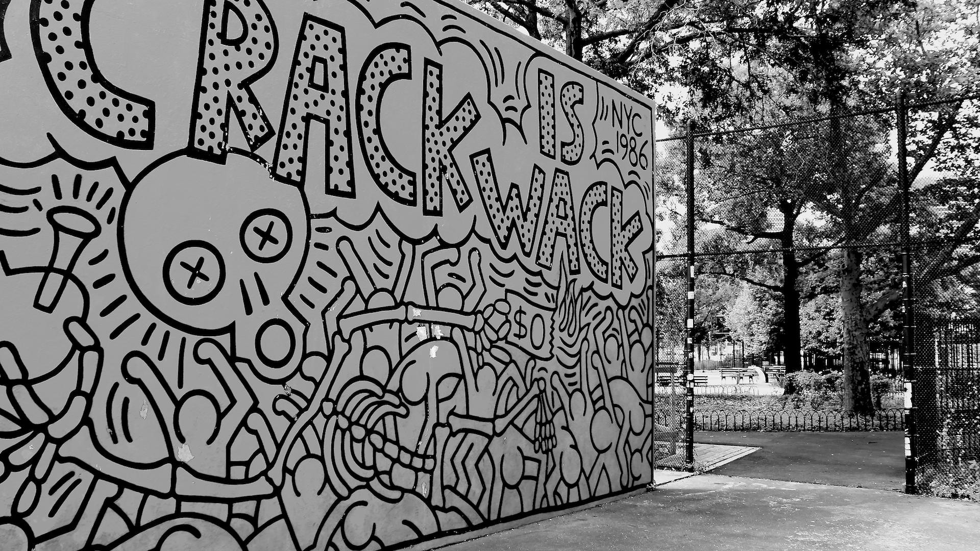
Keith Haring was an American artist whose pop art and graffiti art grew out of the New York City street culture of the 1980s. In the context of the Street and Graffiti Art Movement he brought elements of popular culture, considered as "low art", into the formerly exclusive "high art" spaces of museums and galleries. He mostly employed bright and artificial colors and kept imagery accessible in order to grab the eyes and minds of viewers and get them both to enjoy themselves and to engage with important topics such as AIDS, drug addiction, illicit love, and apartheid.
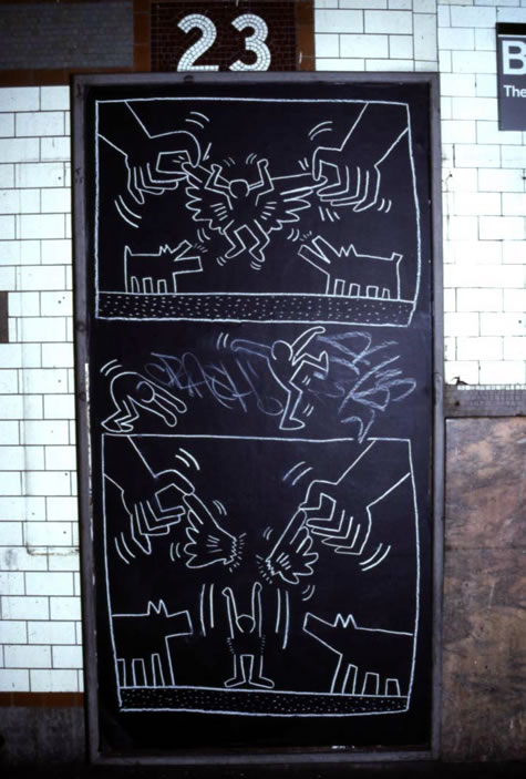
"One day, riding the subway, I saw this empty black panel where an advertisement was supposed to go. I immediately realized that this was the perfect place to draw. Struck by this anecdote, I decided to draw inspiration from Haring's first period of activity, that of the subway environment. So, the background of the article is of a black (#0D0D0D) slightly modified to mimic the empty advertisement space, and almost everything else is of a gray almost white (#F9F9F9) as chalk. The space is exploited in an irregular way in its entirety. For this reason, the spaces between elements are reduced to a minimum.
Haring's commitment to clean lines and simple images is reproduced in the selected typefaces and the frames that often delimit spaces. For typefaces I took inspiration from his handwriting, simple and very clear:
To better give off the idea of handwriting I also applied a small inclination to the main text, as if it is really written on a wall standing and played with the border-radius property to simulate irregular borders (simulator).
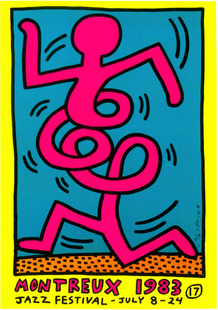
Looking at his works, the will to use fresh and vivid colors is clear. For this reason, despite my choice of black and white, I decided to insert some colors (taken the image on the left) with specific purposes: #0E93B2 for links and #FE0471 for bold. For the same reasons, the images have been modified with the filter: hue-rotate() property, in order to represent bright colors that doesn’t correspond to real-life subjects.
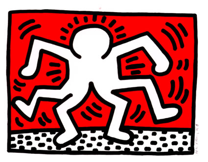
Movement is one of the main characteristics that define the subjects that populate his creations and is visually reproduced with curved lines around the figures. For this reason, I have made several choices.
In our idea we percived a possible futuristic scenario in which there will not be necessary to have a physical device for accessing internet and other functiones nowadays only available through devices(PC, tablets, smartphones...). All these functions would be olographically generated by a microchip placed in your cornea that you could access easily with some tactile sensations related to environment around you. For example to activate an olographich surface from which you could read an article you just have to open your hand in front of you and to connect to the browser.
In this template we used an image taken from Flickr in which is shown an open hand and in which we have placed a transparent and fixed central background for the articles. The color of the background is light red, in code border: 5px solid rgba(185, 73, 73, 0.7);, while the color of the font is white. There is also a little animation that changes the colors of the container of the text. For the different tags we selected shades from red to white.
The font family we used is called Neucha, it seems similar to handwritten text. In the future we think that the handwritten fonts would be really popular as nobody would be able to write anymore and so a style like that would be cosidered vintage and fancy.
The image shape is quite circular as well as the shape of the text contaire, because we thought that this would be the shape of the future. Moreover when the mause is over the images, they have a little animation and they enlarge.
The purpose of this web site is to explore various types of typographic and layout style for text documents, as an end-of-course project for the "Information Modeling and Web technologies" course of the Master Degree in Digital Humanities and Digital Knowledge of the University of Bologna, under prof. Fabio Vitali.
The documents contained in this web site have been selected for their length and complexity among the best picks of 2018 of www.longreads.com. Their publication here is not intended to be an alternative or replace their original locations:
All copyrights and related rights on the content remain with their original owners. All copyright on the typographic and layout choices are 2019 © XY